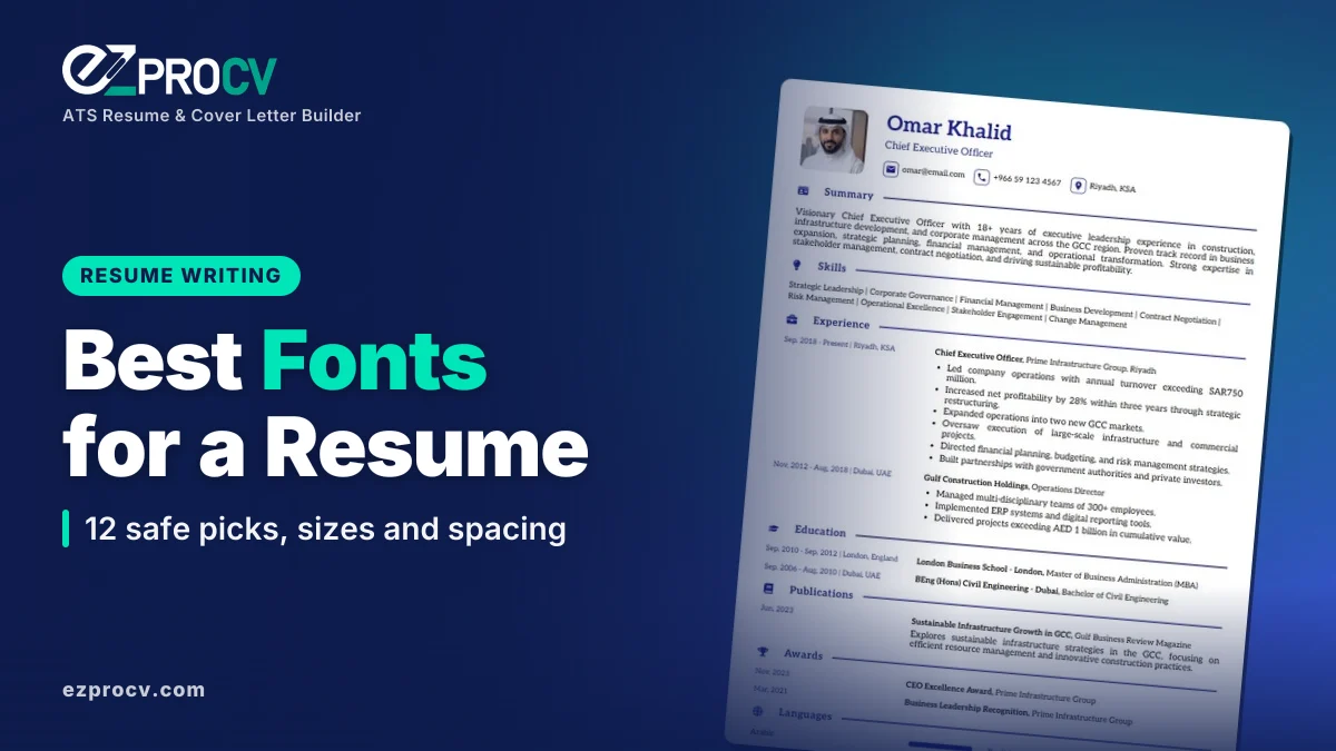
Quick answer: The best font for a resume is a clean, widely available typeface such as Calibri, Arial, Aptos, Helvetica, Georgia, Cambria or Garamond. Use 10.5 to 12 point for body text, 12 to 14 point for section headings and 16 to 22 point for your name. Stick to one or two fonts, line spacing of 1.0 to 1.15 and margins of 0.5 to 1 inch.
Fonts are the first thing a recruiter notices about your resume, even before reading a word. A clean, well-sized font makes your experience easy to skim; a cramped or unusual one makes the reader work harder. Choosing the best font for resume writing is less about finding a "perfect" typeface and more about choosing one that is readable, professional and safe for applicant tracking systems.
This guide gives you 12 safe fonts in a comparison table, the right sizes for each part of your resume, fonts to avoid, spacing and margin settings, and how page size differs between the US and the rest of the world.
What is the best font for a resume?
The best resume fonts share three traits: they are easy to read at small sizes, they look professional and they are widely installed, so your file looks the same on the employer's screen as on yours.
The UK government's National Careers Service recommends a clear font such as Arial, Times New Roman or Calibri, at size 11 or bigger, used consistently throughout. Those three remain safe choices everywhere. Microsoft has also made Aptos the new default font in Word, Outlook, PowerPoint and Excel, replacing Calibri, so Aptos is now a modern, widely available option too.
If you want a single answer: Calibri or Aptos for a modern look, Georgia or Garamond for a traditional one.
Serif or sans-serif: which should you use?
Serif fonts have small strokes at the ends of letters (Times New Roman, Georgia, Garamond). They feel traditional and formal.
Sans-serif fonts don't (Arial, Calibri, Helvetica). They feel clean and modern, and many people find them easier to read on screens.
Both are fine. Pick based on your industry and the impression you want to give.
| Font | Type | Feel | Good for | Notes |
|---|---|---|---|---|
| Calibri | Sans-serif | Soft, modern | Almost any role | Long-time Office default; very widely installed |
| Aptos | Sans-serif | Clean, current | Corporate, tech, admin | Current Microsoft 365 default |
| Arial | Sans-serif | Neutral, plain | Any role | Installed on virtually every computer |
| Helvetica | Sans-serif | Crisp, design-led | Design, marketing, tech | Standard on Mac; Arial is the usual Windows substitute |
| Verdana | Sans-serif | Wide, very legible | Roles where screen reading matters | Takes more space; use 10 to 10.5 pt |
| Lato | Sans-serif | Friendly, modern | Startups, creative, education | Free Google Font; best sent as PDF |
| Roboto | Sans-serif | Technical, compact | Tech, engineering, data | Free Google Font; best sent as PDF |
| Georgia | Serif | Warm, readable | Law, education, publishing | Designed for screen reading |
| Cambria | Serif | Formal, sturdy | Finance, consulting, government | Ships with Microsoft Office |
| Garamond | Serif | Elegant, classic | Law, academia, senior roles | Runs small; use 11.5 to 12 pt |
| Times New Roman | Serif | Traditional | Law, academia, government | Safe but can feel dated |
| Book Antiqua | Serif | Classic, open | Senior and executive roles | Ships with Microsoft Office |
What font size should a resume be?
Most university career guides recommend body text between 10 and 12 points. Coastal Carolina University's career services checklist, for example, asks for 10 to 12 point text and one font style. Use the ranges below as a starting point, then adjust for the font you chose.
| Element | Size | Style |
|---|---|---|
| Your name | 16 to 22 pt | Bold |
| Section headings | 12 to 14 pt | Bold or small caps |
| Job titles and employers | 11 to 12 pt | Bold for title, regular for employer |
| Body text and bullets | 10.5 to 12 pt | Regular |
| Contact details | 10 to 11 pt | Regular |
| Dates and locations | 10 to 11 pt | Regular or italic |
Fonts with the same point size can look very different. Garamond at 11 pt looks smaller than Verdana at 11 pt, so print a page or view it at 100% zoom on a phone before deciding.
Can an ATS read any font?
An applicant tracking system (ATS) reads the text in your file, not how it looks. In a text-based PDF or Word document, each character is stored as text, so standard fonts are extracted without trouble. Our full guide to an ATS-friendly resume covers the layout side.
Problems usually come from:
- Text inside images. A name or heading saved as a picture can't be read as text.
- Icon and symbol fonts. Icons for phone or email may come through as random characters. Write "Phone:" or just the number.
- Decorative or script fonts. Unusual letter shapes and ligatures can extract incorrectly.
- Missing fonts in Word files. If you send a DOCX with a font the recipient doesn't have, their software substitutes another one and your layout can shift.
The safest approach: a standard font, sent as a text-based PDF unless the employer asks for Word.
Which fonts should you avoid on a resume?
- Comic Sans, Papyrus and novelty fonts. They look unprofessional.
- Script and handwriting fonts. Hard to read and risky for ATS extraction.
- Thin or light weights. They fade on screens and in print.
- Condensed fonts. Squeezing more text in makes everything harder to skim.
- All-caps display fonts for body text. Fine for a name, tiring for paragraphs.
- More than two typefaces. Mixing three or four fonts looks messy.
Font pairings that work
One font for everything is perfectly professional. If you want contrast, pair a serif heading with a sans-serif body, or the reverse:
- Georgia headings with Arial body
- Cambria headings with Calibri body
- Garamond headings with Lato body
- Helvetica headings with Georgia body
Keep bold, size and spacing consistent: every section heading should look identical.
What line spacing and margins should a resume have?
| Setting | Recommended | Why |
|---|---|---|
| Line spacing | 1.0 to 1.15 | Readable without wasting space |
| Space before headings | 8 to 12 pt | Separates sections clearly |
| Space between bullets | 2 to 4 pt | Stops bullets running together |
| Margins | 0.5 to 1 inch (1.27 to 2.54 cm) | Under 0.5 inch looks cramped and can be cut off when printed |
| Alignment | Left-aligned | Justified text creates uneven gaps |
Page size by country
- US and Canada: US Letter (8.5 x 11 inches).
- UK, Ireland, Europe, Australia, the Gulf, India, Pakistan, Africa and most of Asia: A4 (210 x 297 mm).
If you apply across regions, use the size of the country you're applying to. The difference is small, but a Letter page printed on A4 can lose the bottom lines. For more on page count, see how long a resume should be.
Non-Latin scripts
If your resume includes Arabic, Urdu, Hindi or another script, for example your name in both languages for a Gulf or South Asian employer, choose a font that supports that script and check the PDF carefully. Arial and Tahoma include Arabic characters on most Windows systems.
Common font mistakes on a resume
- Shrinking the font to fit one page. Edit the content instead; 9 pt text is hard to read.
- Different fonts in resume and cover letter. Harvard's career office advises using the same font type and size for both.
- Inconsistent headings. One heading in 14 pt bold and the next in 13 pt regular looks careless.
- Using color for body text. Keep text black or very dark gray; use color only for small accents.
- Icons instead of words. Write "Email" and "LinkedIn" as text.
- Forgetting mobile readers. Many recruiters open resumes on phones. Test yours at phone size.
Build it in EZProCV
Our ATS-friendly resume templates let you customize the font, colors and spacing, and the live preview matches the downloaded file exactly, so what you see is what the employer gets. Pick the matching style from the cover letter templates so both documents use the same font. Download as a text-based PDF that applicant tracking systems can read, free.
Sources
- National Careers Service: CV sections
- Microsoft Design: A change of typeface, Microsoft's new default font has arrived
- Coastal Carolina University Career Services: Resume checklist (PDF)
- Harvard Extension School Career Services: Create impactful resumes and cover letters
Frequently asked questions
Is Times New Roman a bad font for a resume?
No. It is clear, available on almost every computer and the UK National Careers Service lists it as a suitable CV font. Some readers find it a little old-fashioned because it was the default in older versions of Word. If you like a serif look but want something more current, Georgia or Cambria are good alternatives with similar formality.
Can I use Google Fonts like Lato, Roboto or Open Sans?
Yes, as long as you send a PDF. Those fonts are free, clean and readable, and a PDF embeds them so the employer sees what you designed. If you send a Word file instead, a computer without the font installed will substitute another one, which can shift your layout. That is the main reason to prefer pre-installed fonts for DOCX files.
Should my cover letter use the same font as my resume?
Yes. Harvard's career office advises preparing your resume and cover letter in the same font type and size. Matching fonts, colors and header layout makes the two documents look like a set and signals attention to detail. A cover letter can use body text at the same size as your resume or half a point larger for easier reading.
Is a smaller font a good way to fit everything on one page?
Only down to about 10 point, and only if the font is still easy to read. Below that, recruiters may struggle, especially on phones. Before shrinking text, cut older or less relevant bullets, tighten wording and reduce space between sections. Those changes usually save more room than a smaller font size without hurting readability.